The Pros And Cons Of A Kitchen Island.
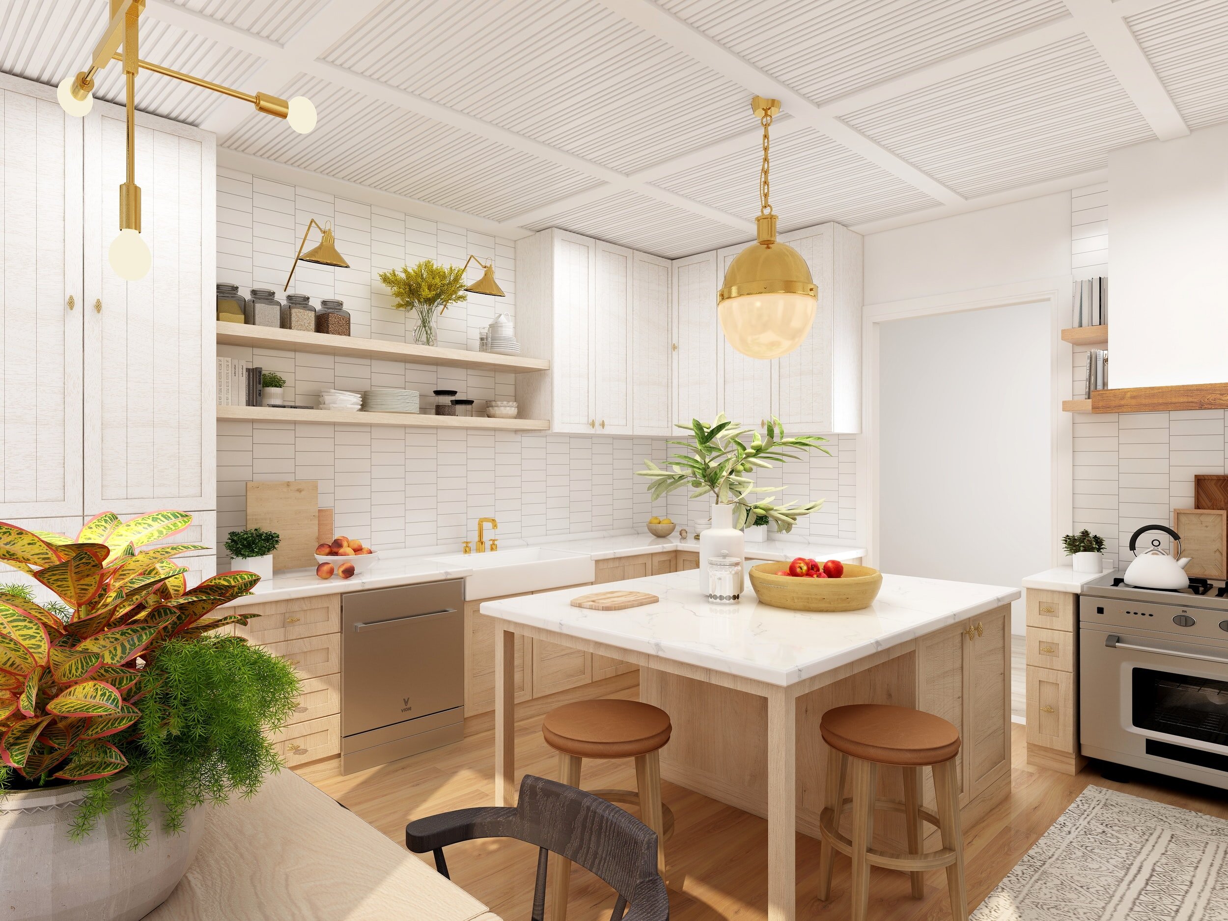
There are quite a few considerations when looking at installing a kitchen island. If planned out correctly, it can add additional storage and counter space to your home. Poor planning can result in an island that disrupts the flow of your kitchen and incurs an additional expense for a kitchen island that you want to rip out.
So you are thinking of installing a kitchen island in your HDB, Condo or Landed Property? Let’s look at the plus points and the drawbacks to installing a kitchen island. Ultimately, you want the kitchen island to be functional and add to the aesthetic of your home, but you need to ensure you have enough space and that it doesn’t disrupt the flow of your home.
Pros
Space.
Firstly, keep in mind that the function of an island is to have all sides open to working on. If there isn’t enough space in your kitchen, you’ll end up bumping into it more than anything else. For unrestricted movement, experts suggest you need at least 1 metre of clearance on all sides when you draw up your kitchen island designs, without which the island may become an obstacle.
If there is enough space for a kitchen island, there are still things to consider to make sure it’s suited to the design. Even in larger kitchens, sometimes it’s hard to get as much counter space as you want. An island can help create an extra landing space for hot dishes, extra prep space, or even a spot to do your baking. It can also play into the visual/aesthetic portion of the design if you choose to make that countertop a contrasting or accent colour.
Storage.
Similar to counter space, an island can provide more cabinet space under the counter. The area beneath can be used for additional storage to help you organize your pots, pans and other necessities. And, if you have the extra space, you can even add an appliance to your island.
Added Seating.
An island can also be used for kitchen seating by adding a breakfast bar to one side. An island with seating, such as barstools, gives you another place where friends and family can gather to talk and create memories.
Space Definition.
In an open concept plan, there are no walls on one or more sides of the kitchen. An island can provide added countertop space with no walls, but can also form a virtual divide between a kitchen and the adjoining spaces without closing it off. This can even out the work triangle and make space for the cook to work while still visiting the company in the other room.
Adding a kitchen island can easily convert a kitchen layout. For example, an L-shaped kitchen can quickly be turned into a U-shaped kitchen with an added island. Then, with an open concept plan, you can interact with those not in the kitchen while you’re creating meals.
Cons
Not suitable for wiring and venting.
The centre of your kitchen may not always be suited to wire or vent. Check with your designer to see whether it is safe to install a cooker or plugin appliances, so you can have a secure cooking experience.
Remember putting a cooktop on an island, it’s not only hard to vent, but a hot surface in an open area can be dangerous for children or people reaching across.
Disrupts the work triangle.
Ideal kitchen layouts with an island should have easy access to the cooker, refrigerator, and sink (the work triangle). An island can disrupt this structure and put obstacles in the way of preparation, cooking and cleanup.
Comparatively expensive.
Adding an extra workspace in the kitchen means adding more materials which could mean greater costs. The extra countertop and cabinets might add up to more than the flooring that would otherwise take the island’s place.
Summary
In summary, there are quite a few considerations when looking at installing a kitchen island. If planned out correctly, it can add additional storage and counter space to your home. Poor planning can result in an island that disrupts the flow of your kitchen and incurs an additional expense for a kitchen island that you want to rip out.
A Guide To Mid Century Modern.
The long-lasting popularity of the Mid-Century Modern style is based upon numerous factors. It provided us with tidy lines, mild natural curves, a love for various materials and designers that are idolized even today. But how can you bring it into your HDB, Condo or Landed Property? Follow our 9 step guide to create the ultimate mid-century modern style into your home.
9 step guide to bringing the mid-century modern style into your home
The long-lasting popularity of the Mid-Century Modern style is based upon numerous factors. It provided us with tidy lines, mild natural curves, a love for various materials and designers that are idolized even today. But how can you bring it into your HDB, Condo or Landed Property? Follow our 9 step guide to create the ultimate mid-century modern style into your home.
Mid-Century Modern Style
Bauhaus designers and designers who migrated to America as an outcome of financial modifications in Germany after the Second World War started the style movement called Mid-Century Modern. It's defined by simplicity and performance. While there is some dispute about when the duration started, it approximately lasted from the mid-1930s to the mid-1960s. The ageless quality of the design, nevertheless, continues to interest today.
The differentiating functions of this style consist of a timeless, downplayed appearance, and tidy lines with very little difficulty.
Performance is very important, as form follows function.
Sleek and uncluttered lines with both natural and geometric lines.
Very little ornamentation or ornaments.
A mixture of both standard as well as non-traditional materials.
The juxtaposition of various, and in some cases contrasting materials.
Wood Is Key.
Most of today’s furniture is made of engineered pressed wood. Let real wood take centre stage via the high-quality furnishings of the ’50s. These mid-century masterpieces have clean lines of teak, walnut, oak and rosewood. Maybe hunting for these old pieces seems like too much work. Or maybe an original piece from George Nelson or Noguchi piece is out of your budget. If so, there are plenty of modern-made replicas to be found that mimic these elements. Thanks to the increasing demand of this design movement, many retailers are grabbing hold of the trend by offering lower-end furnishings that nod to this style.
2. Use Modern Lighting.
Look at any mid-century modern home and you will surely see dazzling modern marvels dangling from the ceilings or lighting up sleek side tables. Unique pendant lights and fixtures are not only functional; they are pieces of sculptural art. There are numerous online artists who custom-make these architectural lights. Look around until you find the piece that calls your name, and remember mid-century modern is not a matchy-matchy style, so no need to find lamp sets. Indeed, bold lighting is another must-have accessory to take your home back in time to this artistic era.
3. Mirror, Mirror on the Wall.
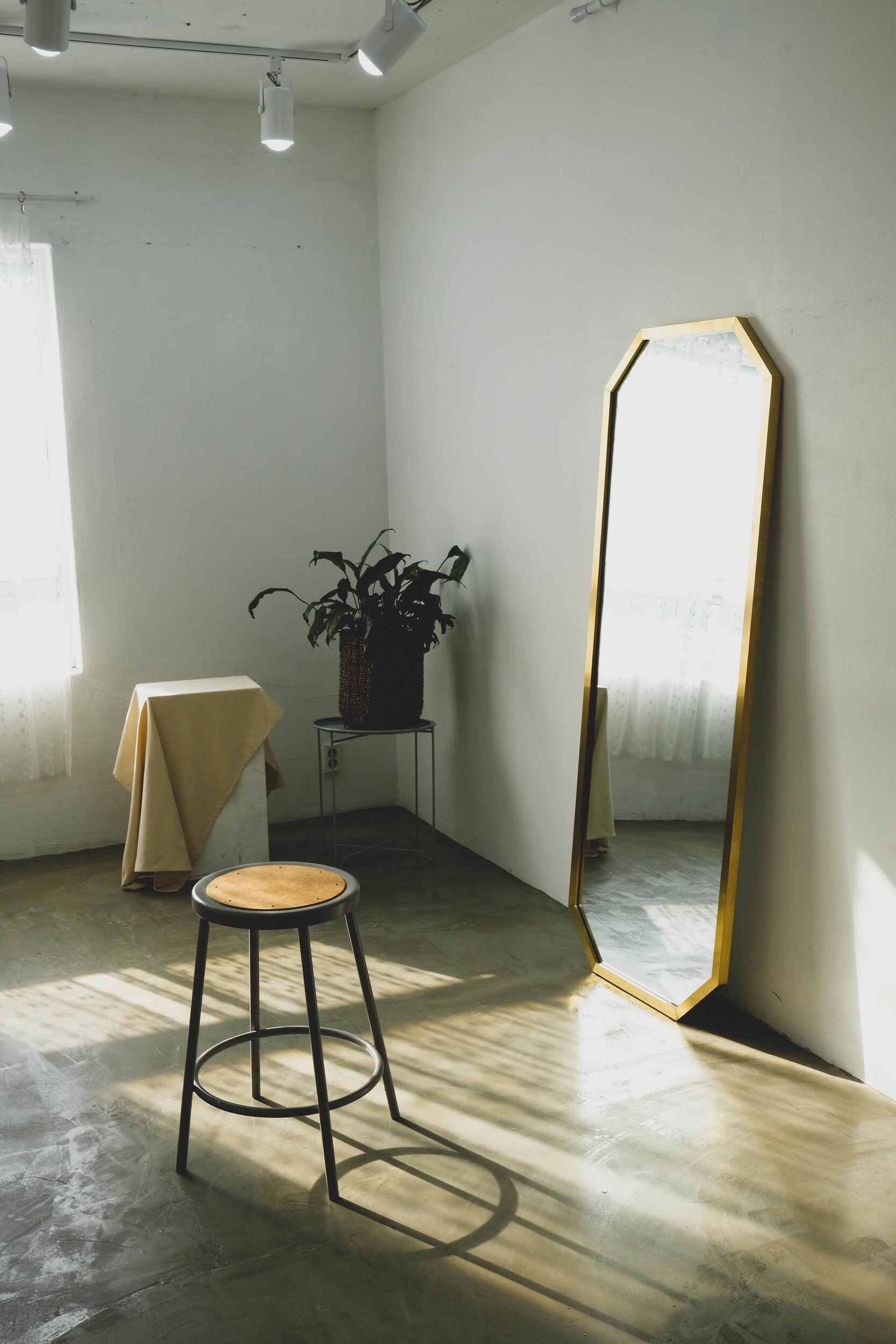
No matter what style of décor you choose, mirrors are the perfect design accessory. They add a light airy feeling to any room in your home. If placed properly, a mirror can make a space look bigger by reflecting light into a room or highlight a beautiful backyard landscape by placing it opposite a garden door or window. A sunburst mirror is an icon of this era. It is simply a must-have accessory that shines mid-century into your home. There are plenty of replicas or originals to be found online or in stores.
4. Wall Colour – White Is Right
Most mid-century homes had walls covered in white paint. Why? Because it allowed for the high-quality furnishings to take centre stage. Mid-century homeowners were proud of the craftsmanship of their home and furnishings, and white paint let the rest of the room show off its lines. What an easy mid-century design solution!
5. Small Details Can Make the Difference
Sometimes it’s the simple things added to your décor that make the biggest style statement. One or two artistic metal wall plaques or a large graphic oil on canvas can make a bold style statement. For a modern look, don’t clutter your walls with tons of artwork. Keep it simple and clean with a few bold, high-end pieces of art. After all, isn’t it better to have one or two high-quality pieces instead of a bunch of inexpensive knick-knacks?
6. Wallpaper – If You Dare
While most walls benefit from clean white lines, a touch of glamour in a dining room can be added by simply papering one wall with bold glitzy wallpaper in a graphic pattern. If you don’t like the idea of permanent wallpaper, then try some of the higher-end wallpapers that easily peel off. Homeowners in this time period loved their bold, graphic prints.
7. Mix And Match Different Styles
Just because you don’t have a Mid-century home, it doesn’t mean you can’t embrace retro style. With an emphasis on simple lines and purity of design, combined with the enduring beauty of wood, Mid-century timber furniture, such as these original Ercol sofas, have a timeless appeal, which sit well with other styles both old and new.
8. Introduce Retro Fabrics
For a quick and easy retro pop try updating a lamp with a shade in a retro print or styling a plain sofa with cushions made from 1950s fabrics. Mid-century designs are very functional and bright. Organic and geometric forms/patterns are most often utilised. In addition, mid-century modern designs explore traditional and unorthodox materials at the same time, they are based on contrasts and intriguing juxtapositions.
9. Be Bold, Be Eclectic, Be Experimental
Mid-century modern design doesn’t have to be exclusive. If you already have modern pieces you love and would like to keep in your home, you can buy a couple of mid-century furniture pieces that you’re missing. Determining whether these mid-century items will go well with the rest of your belongings depends on your style preference.
9. Keep to a Guiding Theme
A final thing to keep in mind is that pulling off a stylish mid-century modern design can be tricky. Eclectic choices and contrasting decisions can easily contribute to clutter and chaos. If you go for way too many ideas, you’ll feature distinctive pieces that will be fighting for attention. Thus, you need to come up with some guidelines before getting started with the execution
Your Complete Guide To Creating A Gallery Wall.
Are you looking for an alternative to the feature wall? Want to display your family photographs or art that you love in a way that matches your home design? Then a gallery wall might be for you. Follow our 6 step guide to create your very own gallery wall.
Why A Gallery Wall?
Are you looking for an alternative to the feature wall? Want to display your family photographs or art that you love in a way that matches your home design? Then a gallery wall might be for you.
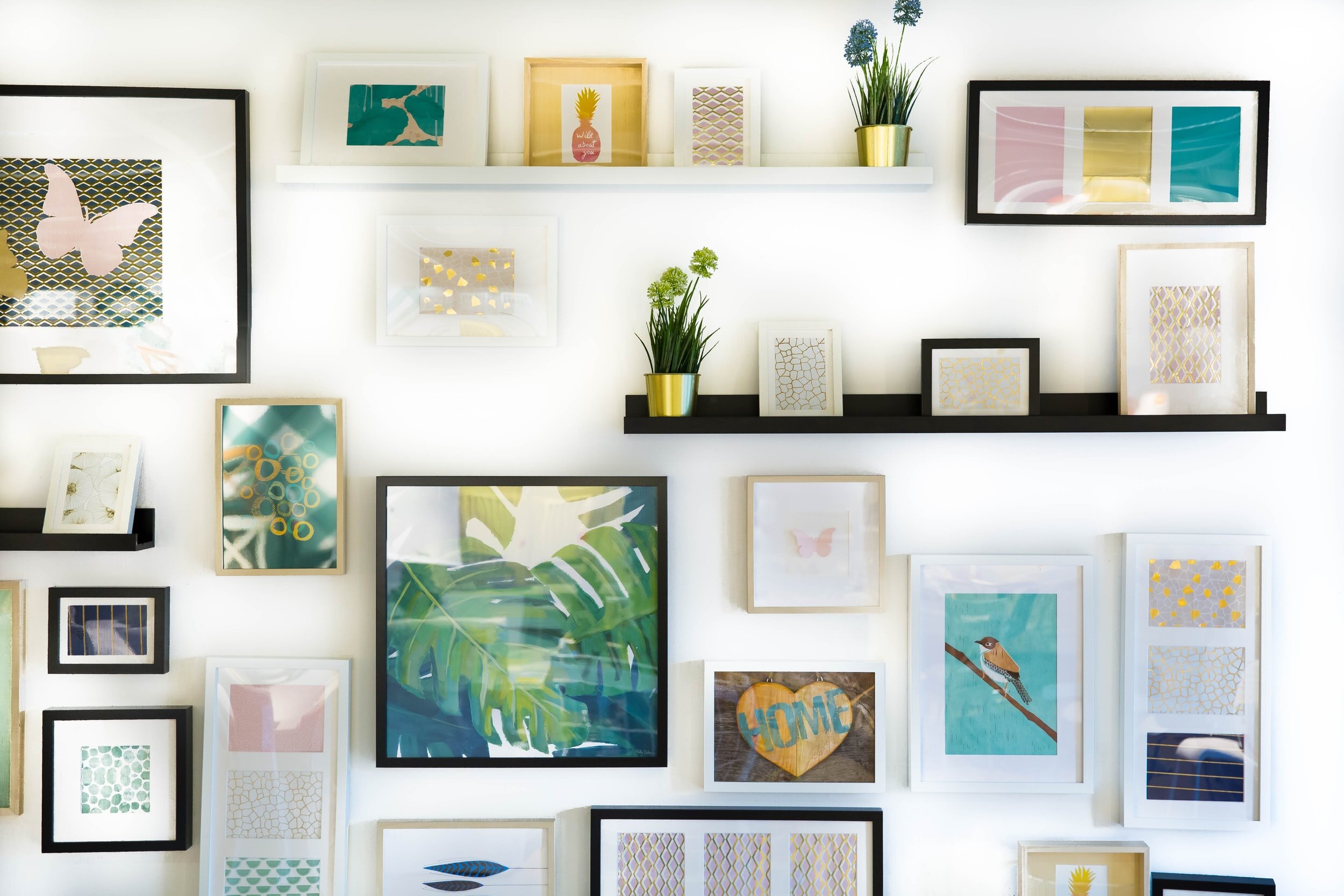
Gallery walls or photo walls have become quite popular over the last few years, providing an easy way to update your interiors, transform bland walls, create a focal point in your home, and bring some character and personality to your living space. Instead of using paint or wallpaper for a feature wall, you can do so with a gallery wall, and it can be placed anywhere in your home. Pulling a gallery wall of your own together might feel a little daunting at first. Art can be expensive, and curating personal items/photos can take a decent amount of time.
What is a Gallery Wall?
A gallery wall is a curated display of photographs, posters or prints, creatively arranged on a wall, commonly made using photo frames.
What kind of Gallery Wall to choose?
There are two main options to consider for your Gallery Wall:
You can create a Gallery Wall using your own photographs and art and purchase suitably sized picture frames to hang on the wall.
You can buy a curated set of framed wall prints (these are often themed such as botanical or landscape prints), that you can simply hang on the wall.
Creating Your Gallery Wall.
1. Start Collecting.
You need to know what you have to work with so your first step is to start collecting things that you think might work for your Gallery Wall. These can be photographs that mean a lot to you such as wedding pictures, it could be a keepsake or sentimental items such as your wedding invitations or it could be pieces of art or prints that you really like.
Remember inspiration can come from anywhere. It could be from your favourite coffee shop, at a friends place, a Pinterest board. There is inspiration everywhere, once you start to research you will notice Gallery Walls come in many different styles and there are very few set rules to creating them.
Narrowing down what you want to have within your Gallery Wall is an important part of the process, you need to know what you have to work with.
2. Build a Theme.
When you have a selection of images or art that you're happy with, pick out your favourites. Start to group these by themes e.g. family celebrations, weddings, art prints that you love, holidays or trips. Be creative and focus on groupings that means something to you, after all, you will be the one looking at these days. For art or prints, select colours that go with your room decor or suit the tone of the space that you want to put your gallery wall in. Take your time to do these groupings. You may change your mind multiple times and that’s part of the process.
3. Measure up.
Measure your wall space and lay your collection on the floor. Stand back and look at them all together (allow a bit of space between them for the frames). Does anything jump out as not quite working? If yes, take it out. Or is there room for you to add more? Take a photo of your possible combinations. You may end up with several combinations that work. Take photos of them all. It can be really helpful to use masking tape to lay them out on the wall itself so you can visualise where they will be.
4. Pick your frames.
When you are happy with the layout, get your frames. You need to decide whether you want them to blend in or contrast with the wall or stand out in their own right. Decide if you want them all the same, or if you want lots of different colours. A white or neutral frame is perfect for Scandi-style interiors, while black picture frames are more suited to contemporary or industrial themed interiors.
5. Hanging
You'll need nails or picture hooks and a hammer or even, command hooks. Draw lightly in pencil on the walls where the top corners of the frames will be. Measure and mark how much lower down the picture frame you want your nail holes. Start hammering and get them all up. Use a spirit level to make sure everything is straight. If you are not confident that you can do this yourself, ask a handyman to do this step for you.
6. Enjoy The Final Look.
Stand back, enjoy, and bask in the glory of your creation. Remember, your gallery can be easily be swapped or updated with new favourites whenever you feel like it. For example, if you've got new photoshoot prints, you can easily swap them into the Gallery Wall. Just decide what you want to take down and either remount or replace it with a similar-sized piece.
12 Tips To Set Up Your Home Office.
With the world in the midst of a global pandemic, and working from home being part of our collective new normal, many organisations are open to a more permanent shift to remote working even after the dangers of COVID-19 fade. We have put together 12 key considerations when planning your home office within your HDB, Condo or Landed Property.
With the world in the midst of a global pandemic, and working from home being part of our collective new normal, many organisations are open to a more permanent shift to remote working even after the dangers of COVID-19 fade. For instance, Twitter has given the go-ahead for its employees to work from home “forever” if they wish and Shopify’s CEO said, “office centricity is over”.
There will be an ongoing need for homes in Singapore to be able to accommodate work from home in the near to medium term. With demand for larger homes increasing steadily throughout the pandemic, the option of simply shifting to a larger space to add in a home office is not always a practical solution. We have put together 12 key considerations when planning your home office within your HDB, Condo or Landed Property.
Create A Dedicated Workspace.
With space at a premium in Singapore, it can be difficult to have an actual room dedicated as your workspace but it's still essential to have a dedicated space within your home that you work from. With WFH being the norm in 2021 and even as Singapore or other countries across the region reopen, you need to future proof your home. This cannot mean having your “home office” on your bed or sofa. Firstly this is not productive for you which will cause additional stress, but most importantly mixing work with your personal space will make it more difficult for your brain to adapt to “work mode”. Your couch and your bed are made for relaxation. You need to create a space within your home which you will associate with productive work.
You may need to get creative with where to place your home office. It could be set up in a spare bedroom. It may mean carving out a dedicated space within your living room from where you will work. You can look at solutions such as glass or partition walls to split a room so you have a space for working. A great solution, if you are using a room as a sleeping space and a workspace, is to look at loft beds or murphy beds. Your key goal is to separate your work and personal life and create a dedicated zone from where you will work.
2. Don't Sacrifice Form for Function.
Furniture can be multi functional
One of the biggest benefits of having your own home working space is that you are not limited to a soulless office cubicle. Solutions and options are endless as you can now get storage furniture that will match your theme. A desk doesn't have to be a large office table that looks out of place in your space. You should look to choose furniture which matches your space and most importantly that you like. The furniture in your work from home space should be functional yet work within your theme. If your home has Scandanavian decor, warm wood and soft, comfy chairs or a loveseat are ideal if you have the space. A contemporary home office can feature artistic pieces or modern metal furniture.
3. Add Proper Storage.
This of course spends on your job and how much paperwork you may need to keep, but most home offices need to have some storage. If your room is being used for multiple functions, having dedicated storage can be used to store your work equipment such as your laptop at the end of the workday.
Your work from home office should have dedicated storage space for all your documents, to keep your supplies such as printer paper (or even the printer itself), out of sight. This shouldn’t mean that you have to spend hours searching for what you need daily. The storage you select needs to be functional and work for what your particular needs are.
4. Choose A Desk That Suits Your Needs.
Choose a desk that suits your needs
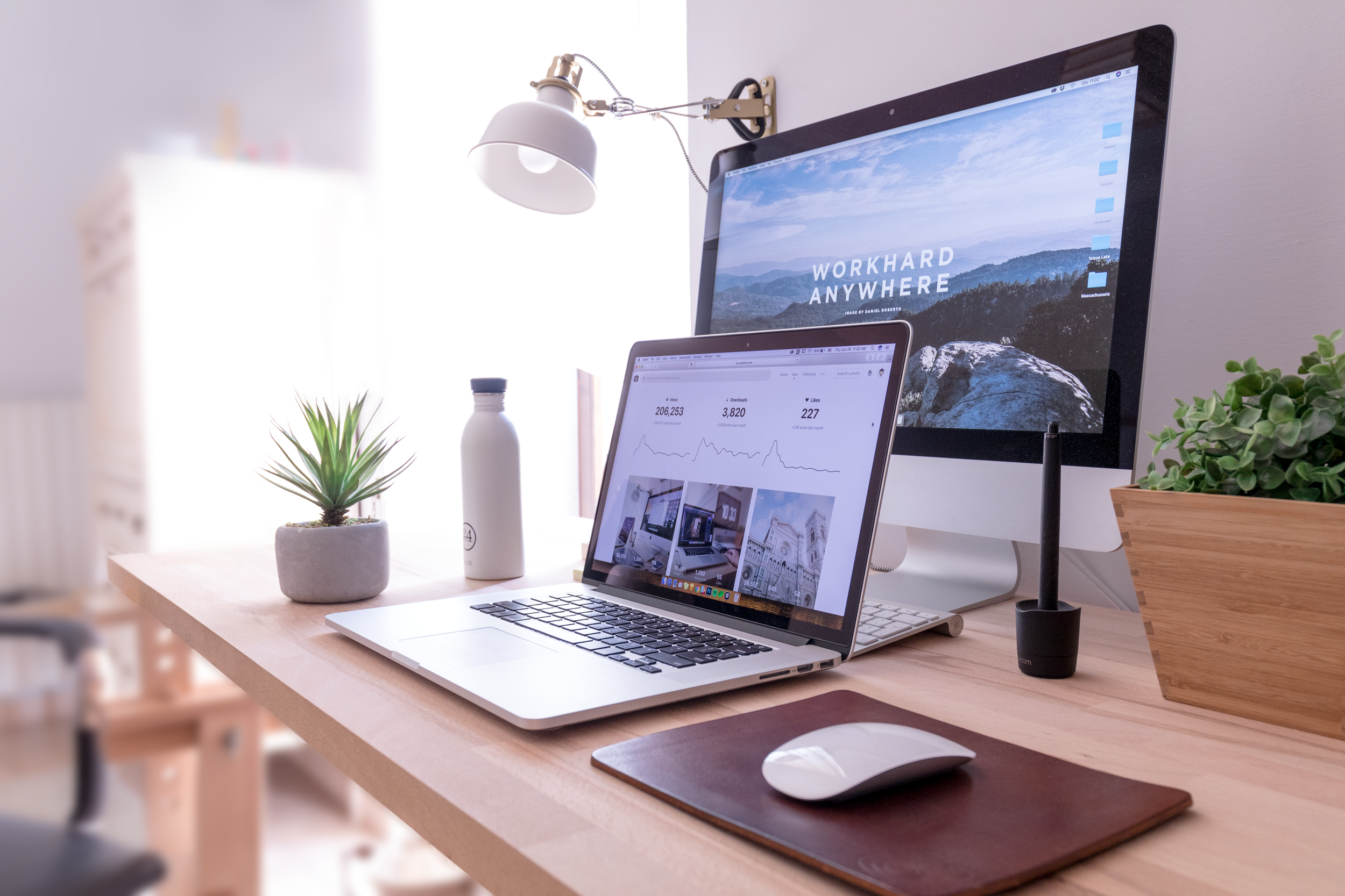
Your desk height should be such that when you type on the keyboard, your arms and hands are parallel to the floor. Your feet should be flat on the floor, and your legs should fit comfortably under the desk. Many desks now come with height-adjustable legs. If you already have a table and cannot invest in a new one that supports this posture, get yourself a height-adjustable keyboard tray or a footrest to correct your alignment. If you have a large home office space, you could get a large table with lots of shelving. If you have to fit a table into a nook, consider a corner desk that will fit compactly in a corner under which you can tuck in your chair as well.
Another important factor is the access area to your home office. Can your large table be dismantled to move through the door? Or will it fit through the access passage? What desk you choose will also depend on your working style Do you just need a laptop and a water bottle, or do you need to surround yourself with pin-ups, photos, plants and the like around your laptop? A final consideration is how to hide unsightly cables. Holes or channels for cords are an excellent way to keep those pesky wires hidden. You could even have a hidden storage box mounted just under your table to store the unsightly wires and cables.
5. Consider Adding A Standing Desk.
A standing desk can help you be more productive
There is so much buzz around standing desks! There are so many great standing desks available on the market that will suit your personal style. Studies suggest sitting for long periods of time can cause serious health issues and weaken the overall strength and endurance of people who lead sedentary lifestyles.
Working at a standing desk means that you are keeping your back and overall posture at the best levels and actually burning calories while simply standing and working. Experts recommend using a standing desk for at least 3 – 4 hours a day.
6. Invest in a Great Chair.
Investing in a comfortable & ergonomic office chair is also an important design choice for your home office that will affect your productivity. A great desk chair will not only make you feel like you’re sitting on a cloud all day, but it will also provide lumbar support & help avoid back problems in the future.
A good office chair can boost productivity by allowing you to stay comfortable and focused for longer periods of time. The back is usually the first part of the body to suffer from sitting down all day. So look for a chair with back or lumbar support, which usually comes in the form of extra cushioning on the backrest. Not all office chairs come with armrests, but these are good to have as they give you extra support if you need to lean on something.
Also, consider material. Leather tends to be more expensive and feel more luxurious, but unless you’re prepared to sit in air conditioning all day, breathable material like mesh would be more appropriate in Singapore’s climate.
Another thing to look out for is adjustability. The best office chair in the world is pointless if it’s too high or low. Armrests and tilt may also be adjustable.
Bring plants into your home office
7. Bring The Outside Inside With Plants.
You should also consider decorating your home office with a few indoor plants. Indoor plants are a breath of fresh air to any space that they occupy, including your home office. Plus, they’re the type of decoration that won’t distract you from your work. They can also help filter out the air inside your home office design, while simultaneously improving your psychological well-being.
If you are not green-fingered, you can always opt for beautiful fake plants which will still add greenery to your home and make you feel like you have brought the outside inside.
8. Forget “Office Beige”.
One of the biggest advantages of working from your own space is that you have the freedom to paint or wallpaper your walls to your taste. You need a colour that gets your work motor humming. For some people, that's a bright, cheery colour like orange or lime green. Others need a calming shade like botanical green or seafoam blue to perform.
9. Your View Can Inspire You.
Position the desk where you can stare at something more interesting than a blank wall (even if you do love the colour) when you glance up from the computer. Feng Shui experts suggest positioning your desk in the power position where you can see the door and your back is to the wall. Make the most of your windows' natural light by positioning your desk where the window is to the side. Investing in blinds or curtains means you can also control the amount of light coming into your room, essential with Singapore’s weather.
10. Choose Accessories That You Love.
Make your home office your own with unique accessories
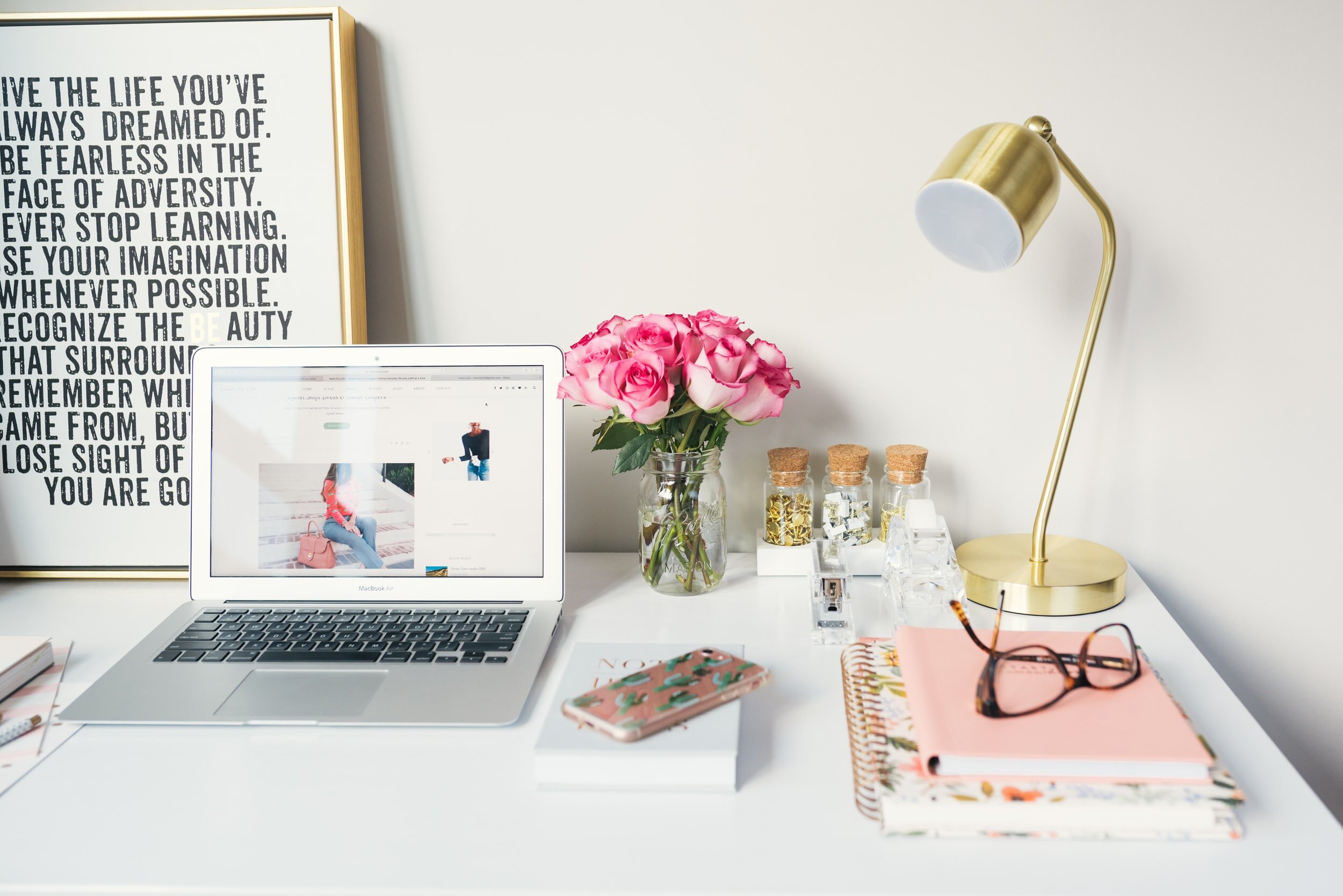
Unless you're going for a contemporary look, choose extras that enhance the comfortable feeling of your home office. These can be simple such as a mug you love to have your Kopi from in the morning or a quirky pen holder. Hang inspirational prints on the walls, whether that's simply your kids' framed artwork or a classic painting. Remember, you can always have a virtual background for your daily zoom calls, giving you the freedom to accessorise your space.
11. Control the Noise Level.
If you’re the type of person that gets easily distracted by noise, you can invest in items that will help control the noise level that you hear from the outside world. It could be as simple as curtains to minimise the noise coming from your neighbours or a rug on your floors to cushion the sounds of your kids playing in the next room. A simple solution is to invest in some noise-cancelling headphones or a speaker for your desk.
12. Invest in Suitable Lighting.
A desk lamp brings better light to your work from home setup
If you rely on natural light to brighten your home office, this can affect your productivity in ways that you might not be conscious of before. Since natural light changes as the day continue, you need to be mindful of the changing lighting situation in your home office. You must have noticed this situation in your office building – there are bright lights on throughout the day to add to the natural lighting. This helps employees stay in a fresh state of mind for longer.
Using desk lamps can help you zone out from your surroundings and just focus on the work in front of you. It may seem underrated, but good lighting can enable the best home office experience you need. You don’t want your home office design to be too bright that it makes it hard for you to see the screen and cause eye strain. You also don’t want it to be so dark that you struggle to make out what you’re trying to look at for work.
9 Tips To Maximise Space In A Small Apartment.
With apartments becoming smaller, not to mention more expensive, when you find yourself short on room and moving simply isn’t an option, we have 9 tips to maximise the space within your apartment.
With space at a premium in Singapore, every centimetre counts
According to URA data, from Q2 2020 (remember Circuit Breaker was in place) to Q1 2021, the percentage of non-landed private property (including Executive Condominiums) transactions involving properties measuring 90 to less than 100 sqm fell from 11.27% to 10.54%. Meanwhile, the percentage of transactions involving properties measuring from 100 to under 120 sqm rose from 13.01% to 17.29%. The average 4- to 5-room apartment measures about 90 to 120 square metres.
With homes now having to perform more functions than ever before, think work from home, accommodating multi-generational families, our elderly living longer, maximising what you can do with your space is a key consideration for many Singaporeans. Buying a larger home, is for many, simply not an option. With that in mind, we have put together top tips to maximise your space.
Declutter before choosing storage options.
Decluttering will free up space for the things you really need within your home
It’s human nature to hoard things, we don’t want to let go and “you never know when you might need that again”. Clutter isn’t a specific challenge only to smaller homes, larger homes also can have storage issues.
The best advice is to declutter your space to only install storage space for those items that you truly want to keep.
A guiding principle you can use is that each item must meet two of the following three criteria: its beautiful, functional or sentimental. With this in mind, you can start to clear out one cupboard at a time and see how much space you get back to your home.
Don’t know what you do with the items you no longer need? You can of course sell them using platforms like Facebook Marketplace or Carousell or there are also many charities and free Facebook groups where you can donate your items to someone who needs them. This means saving the planet by saving items that can still be used from landfills and giving your items a second lease of life.
2. Make the most of your wall space.
Save space with wall mounted over the bed lighting
One rule to rule them all, “think tall when small”. With floor space becoming even more limited, you need to make your wall space work even harder to accommodate your needs. If you can, get storage options that go up to the ceiling, or at the very least that you can place items on top of to maximise storage space. Another option is to install shelving that you can place baskets or boxes onto to not take up precious floor space.
3. Wall mounting is not just for storage.
Similar to storage solutions that take up the wall rather than floor space, look at what in your home you can mount on your walls to give you back precious square footage. A great example of this is mounting your television to the wall, there are now many solutions available to hide the cables so you get a clean seamless look but save on space. Another option is to look beyond table lamps which again take up real estate in your home. A slim floor lamp or even wall sconces can save you space whilst still giving your home soft lighting options. The underlying principle to remember is that if you want your space to feel larger, then it has to look brighter. So don’t skimp on the lighting, explore different options to bring light into your space whilst maximising the space available to you.
4. Add built-in furniture.
Whilst this option is more expensive than freestanding furniture, it is worth considering what built-in furniture makes sense in your home, will give you additional storage and give the illusion of a bigger space.
Do you have a recessed wall in your bedroom? Look at how you could get a custom-built wardrobe that makes the most of this odd shape but also adds storage for clothes. Platform beds are a great example of smart home design which takes up the same amount of space as a freestanding bed but has built-in storage.
Look at your dining area, can you build in benches that will not only maximise the amount of seating you have but also can have storage built-in.
5. Multi-purpose furniture
Nesting coffee tables can be put away when not in use
Make your space work harder for you by selecting multipurpose furniture. If you want multiple coffee tables that you can use when guests come over, consider getting nesting coffee tables that save space when not in use. Need a dining table that can accommodate you and your partner but you will need to replace it when your family expands or you have guests over? Why not look at an extendable dining table and have folding chairs that can seat additional guests. A dual-purpose ottoman is a great example that can double as storage space, additional seating or if you pop a tray on top, it can even work as a coffee table.
6. Trick the eye with your window treatments.
Well hung curtains can change the feel of your room.
Swapping out the materials you use in your curtains can instantly change the look and feel of your space. The end goal, make your room seem larger than it actually is. To do this? Maximise the height of your room as well as the available natural light. That doesn't mean of course raising your ceiling, it's all a trick of the eye.
If you want your ceiling to appear higher, hang curtains above your window frame. A good rule of thumb is to hang about two-thirds of the distance between the top of the window and the ceiling. Next, you want to maximise the amount of light that comes into your room. If you extend the curtain pole out approximately 15-30 cm to the side of your windows, when the curtains are open, you can push them all the way back from the window to let in the most amount of light.
Let’s face it, custom made curtains can be expensive. To save you money, consider buying store-bought curtains and using multiple panels. For example, IKEA may have the curtains you want but not the right width, you can use one pair of curtains i.e. both panels on one side of the window and one pair of curtains on the other side.
7. Use mirrors to bring in light.
Mirrors reflect the light within your space.
Mirrors are a great addition to a smaller space as they double the visual space of an area whilst reflecting light around your home. They also can break up a wall visually giving the illusion that you have more space than you have.
8. Unify your colour palette.
Moving from room to room in a smaller space, whether it’s open plan living or a series of smaller rooms, is easier on the eye and opens up space if you have a neutral unifying colour palette. It can be quite jarring moving room to room full of bold colours when the space is quite small. That said, we are not advising you to abandon colour and go all white, you have plenty of options to bring colour into your space.
Well placed art can bring personality to your home.
Pro-tip - you can look for paint that has a slight sheen to it, this helps to reflect the light and therefore give the illusion of a more spacious home.
9. Artwork adds colour.
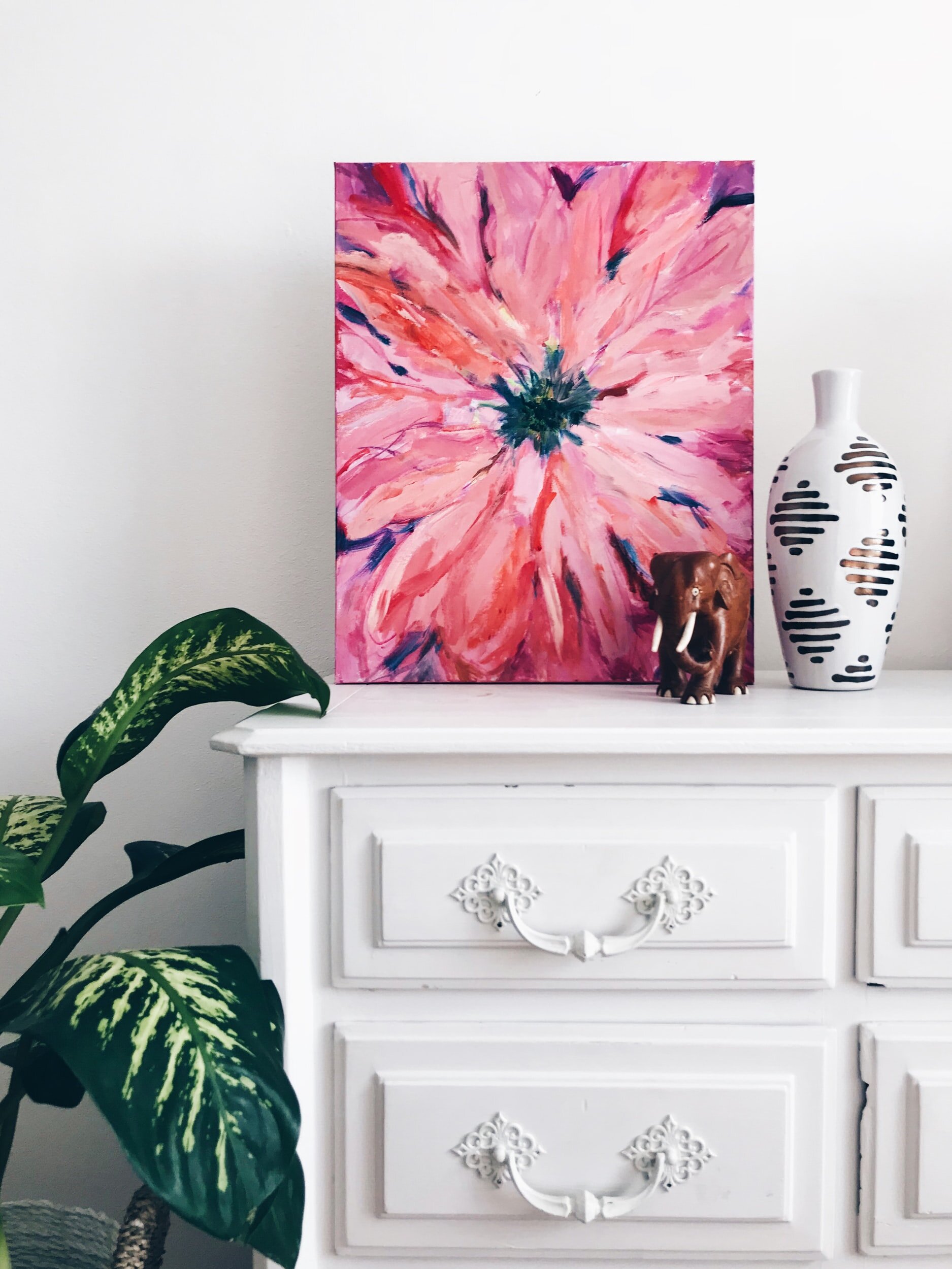
Yes, we spoke about having a unified neutral colour scheme, however, that doesn’t mean that your home needs to be devoid of colour or personality. Add bold splashes of colour with art. You can bring in personality but avoid the cluttered look by choosing one key piece per room that draws the eye.


